In text, as in code, I prefer to optimize for easy reading rather than faster writing.
If I might, modern people tend to find cursive difficult to read. This depends somewhat on culture (nastaliq is the default in Iran) but is a kind of generalized trend that holds for most modern developed countries (see gyousho and sousho almost disappearing in daily use in Japan outside of menus and signage and - increasingly rarely - formal letters). It's not as if, I think, that when these older forms were more common that people struggled to read them (at least, not anymore than individual handwriting typically causes problems).
People who grew up writing cursive also often struggle with older scribal hand (though less so than someone who did not grow up with cursive), say from 1500s-1700s. Again, I think it's unlikely that the writers of those hands were so constrained by medium and technology (or cultural norms) that they chose to write in a way that was deemed inaccessible. (One might, if not attenuated to it, say that sousho is akin to deliberate cultural obfuscation, but my experience suggests that you quickly learn to recognize the patterns in kuzushiji.)
In the case of CJK scripts, brush pens haven't changed. Fountain pens are perfectly adequate for cursive (though some nibs were developed that differ specifically to make them even more suitable). For nastaliq, as for naskh, a reed pen is fine for both. (Modern pencils, ballpoints, and typical modern Western-tipped FPs do struggle to give nastaliq the line variation needed for a legible result). For Western scripts, pens and their tipping simply hasn't changed much beyond a decrease in the flexibility of nibs in FPs. (Something which also varied historically - pens oriented at most shorthand styles always had hard tips, excluding those shorthand styles that incorporate line-width variation which was meant to be achieved with a flexible tip.)
So my thinking is this is mostly something that comes down to 'are you used to it' and shifts in this area have a lot mroe to do with culture than anything else.
There are of course two other matters.
First, how easy something is to learn - I think the only place this is a consideration is sousho of the scripts I've mentioned (even with nastaliq's hundreds of thousands of possible ligatures).
Second, are the people around you accustomed (culturally) to the hand you are writing in, and how hard is it for them to adapt if they are not. Broadly speaking, people are not accustomed to reading much cursive in general these days, let alone one that varies from the recent hands of the area. So generally if one is writing for coworkers say, one would do well to simply write in print or at most a semi-cursive style.
In that regard the more that something deviates from its print form, the harder it will be to read for them. This ultimately comes down to interpersonal consideration - if you're writing for yourself or people who are regularly reading/writing cursive, I don't think the author's changes will be a significant issue beyond a short acclimatization phase that does not extend far beyond the phase that would be needed to adapt to an individual's personal quirks in a hand that has had some recent sway in the local area (and those hands do differ by country/area, quite a lot). (As a tangent, some of these tricks of the author's are commonplace in specific historical European hands.)
I wonder if that makes my handwriting harder to read for anyone who isn't Dutch and over 40 years old.
Anyway, just bringing it up because you don't need to lift up your pen to write that kind of "t".
Search for "koordschrift" on https://primarium.info/countries/the-netherlands/ to find the illustration showing how I was taught to write it in the late 80s. It's the letter vaguely shaped like a pine tree.
Belarusian Cyrillic requires more backtracking: we have і, ў, obligatory ё, apostrophes. Never saw it as a problem.
Interesting. I think this style completely died out in Russia, I wasn't taught it and never really seen it outside of some old letters and documents. Interesting to hear it survived in Belarus
Having studied Russian in college, I assumed that all Cyrillic script included a line over the т, because otherwise readability goes to hell. Is my impression here based on (a) an opinion of my Russian prof expressed as a universal rule or (b) a thing that's universal in Russian specifically, but not Belarusian Cyrillic or other similar contexts, or... something else?
I'm inferring from your post that you are a native user of Cyrillic who has also learned English. I'm the reverse (well, at least I took Russian in college; I was never fluent then and remember almost nothing now). Something interesting happened to my cohort of Russian learners back then, and I wonder if it's common for folks going the other way.
After we got comfortable with writing Russian in cursive, we found that Cyrillic letters worked their way into our English script. Often, we wouldn't even notice, even when reviewing our notes later. I discovered I'd done this when I loaned some political science notes to a friend, and he couldn't read them because I'd unconsciously mixed Cyrillic and English script. I could read them fine, and so could my Russian-class friends.
We mentioned this to our Russian prof, and he laughed and said it happened to people every year, but he could never figure out who would be prone to it. Sometimes it was top students; sometimes it was people who were struggling.
(It was in this era that I ended up pretty much abandoning cursive, because Cyrillic never crept into my printed handwriting. 35 years later, my cursive is abysmal.)
Did you end up mixing script in your native handwriting inadvertently?
I stopped using it right after graduating high school (where it was required), never used in drafts after elementary school, and only ever used normal print letters in the university (and also included TeX commands because I was typesetting lecture notes later and was figuring out the optimal command set on the fly).
Personally, I’m content being a dinosaur who writes one letter at a time (in handwriting that has been praised for its neatness and clarity ever since I was at school myself) or uses computers to render the text for me (where I have long had an interest in typography and quite enjoy making pretty text using elaborate cursive fonts, but for special effects and interest, not for body text and legibility).
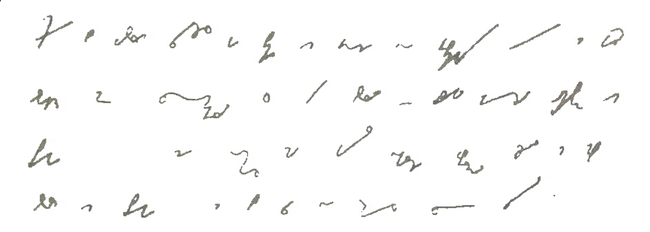
The flow of a cursive shorthand system is unmatched by anything else. I highly recommend learning enougnh to experience it.
(The drawback with more phonetic systems like Gregg is that one has to learn entirely new ways of spelling words. But normal English spelling is so complicated that tradeoff can be worth it for heavy usage. Orthographic systems often also contain phonetic components, but they tend to be optional extensions that improve efficiency, rather than required like with purely phonetic systems.)
There is evidence that typing is actively bad for memory rentention compared to writing things down with a pen. I wonder where Stenography falls in this continuum.
Longhand forces summarisation, but it's still possible with shorthand.
The point of the phonetic systems is that you don't have to ‘spell’ words at all: what you say is what you write.
(Then there are briefs, of course, but those are for additional benefit.)
Other languages are similar: for German if you look at either Kurrent or Sütterlin really only i gets special treatment. The umlauts are given as two dots in examples, but when i read letters and other informal documents they usually end up being a bar.
I like the connected dot for i and j! Clever, and i will try to adopt it. Most of my handwritten writing these days is for myself.
That being said I don't think it is about Cyrillic vs Latin but more about traditional cursive vs modern.
The traditional Latin cursives were all pretty much optimized to be written in one running flow. Kurrent and cursive all come from Latin currere which means running.
Admittedly none of them go as far as connecting the i and j dots but otherwise they are pretty much completely connected. But then again I also never seen anyone writing a word and doing the dots afterwards. With traditional cursive you do your upstroke, lift the pen, place the dot (or short short stroke), reverse and do the downstroke. Lifting the pen yes, backtracking no.
With the connected dots OP's Backtrack-Free Cursive still wins here and I really like that because someone found an optimization to something that already has been optimized for centuries.
I do it like this, backtracking to add a dot doesn't seem so bad when you're lifting the pen anyways and it doesn't break the flow.
It's been a minute since I've had to write very quickly, but I'd imagine if necessary this step can be skipped. Would have to try it out.
Also, our capitals were a bit more complicated, such as having 3 loops in the H.
> One way to remove backtracking is to lift the pen immediately instead of waiting until the end of the word, as if doing italic calligraphy. Pen lifts alleviate the mental queue problem and give a chance to readjust the palm, but they break the writing flow.
So generally, I'd say that the mental load is basically a matter of how one learned cursive in the first place. Though I agree that the mostly backtrack-free Cyrillic cursive looks more elegant.
Would be interesting to learn about the perspective of people who learned Chinese or Japanese as their first script.
I've gotten comments about how neat my Chinese writing is from people surprised that I don't use handwriting. There's a simple reason for that: I've never learned how to do Chinese handwriting.
Wouldn't the ф as well?
> [for the x], I draw two mirrored c’s
Isn't that what everyone is doing, or are we Frenchmen the exception?
For reference if the author reads this, we write the latin x exactly like the cyrillic х, i.e. reverse c, bottom-left to top-right diagonal, normal c.
I was taught script in the US and Italy as a child, and never learned it like this.
Not if you write it as qo for lower case and oJo for capital.
I don't cross ts either, I tested out on a piece of paper and what I do is a vertical (slightly curved) stroke, loop to the left, cross the stroke and then a downwards stroke.
I tried the jitter example and instinctively I dotted the j but not the i for some reason. Would love to see some research on this.
I really miss cursive honestly, at least for me I feel a much closer connection to the writing than when typing.
Can see how penmanship there would be appreciated.
Somehow, this caption appears to the right of two logos which clearly require two strokes for their ts. What happened?
Plus some uppercase e.g. A, B, H, right?
The Cyrillic script was invented in Bulgaria (during the First Bulgarian Empire), and was used to write Bulgarian language, creating a huge literary corpus, long before it began spreading to Kievan Rus. The Russian language itself comes from Old Bulgarian / Old Church Slavonic, as does Serbian and other "Slavic" languages.
And no, Bulgaria was never part of Russia nor the Soviet Union.
Also, Bulgaria used to own all the land in the world, but because Bulgarians are very kind people, they gave some of it to other nations so that they have a place to live too. Thank you, Bulgarians!
That's some interesting nationalistic propaganda, never heard that one before