163 pointsby bramadityaw6 days ago19 comments
  • haritha-j2 days ago
    For usable diagrams, beyond 3 sets, I always recommend upset plots, I wrote a little piece on them rather recently: https://medium.com/@harithajayasinghe/beyond-venn-diagrams-d...
    • leontrolski2 days ago
      Ditto, another Upset blog post - https://leontrolski.github.io/upset.html
    • Jaxan2 days ago
      In all these pictures, the empty set is missing (-: . Of course you could argue that they’re also missing in Venn diagrams, but it’s common to just point on the outside.
      • bmm6o2 days ago
        One example included the empty set, the other did not. It doesn't always make sense to have it.
      • amelius2 days ago
        The three lightgray circles in the examples are the empty set.
    • turnsout2 days ago
      TIL about upset plots. Really cool! Venn is already unwieldy at three sets, but four is not really doing the job of communicating the set inclusion clearly. Seven is just a geometric curiosity.
  • flobosg3 days ago
    Related: the 6-set banana Venn diagram – https://www.nature.com/articles/nature11241/figures/4
    • Amorymeltzer2 days ago
      Still my favorite Venn.

      I was in a genetics graduate program when this was published, and this spread like wildfire.

  • kugestu3 days ago
    Really nice theoretical exercise! For practical visualization, an UpSet plot is a great option: https://upset.app/
    • JSR_FDED2 days ago
      TIL! Upset plots are useful and easy to understand.
    • renewiltord2 days ago
      Required attribution notice too big. Can’t see myself using it.
  • thadk2 days ago
    Here's a very rough interactive on more recently published 7-way and 11-way venn: https://observablehq.com/@thadk/venn (with clean-ish svg, cites)

    This fork shows an older version with all the shapes turned on and filled with original colors: https://observablehq.com/d/4a5120e490fa9da4

    Santiago Ortiz's venn was from 2013 (via archive.org) . I had forgotten I'd seen that, thanks for sharing.

  • anon2913 days ago
    Nice! I wonder if there's a mathematical theorem to describe the possible shapes for a 2-d venn diagram of N sets or if there's an N for which it is no longer possible (or maybe it's possible for all N!?). Probably an application of graph theory and Euler's formula to determine feasibility and then something else to figure out the shape constraints. Never thought about it, but an interesting idea.
  • vitalnodo3 days ago
    I’m wondering what’s the proper way to draw Venn diagrams. I’ve seen that Graphviz has a “nice to have” mention about them, and there are a few simple JS libraries - mostly for two sets. Here’s also my own attempt using an LLM [1].

    But maybe someone knows a more general or robust solution - or a better way to achieve this? In the future, I’d like to be able, for example, to find the intersection between two Venn diagrams of three sets each etc.

    [1] https://vitalnodo.github.io/FSLE/

  • pohl2 days ago
    Yeah, I know that Upset Plots are a better choice for data visualization — as everyone is pointing out — but take a moment to appreciate this beautiful etude for what it is. This nicely executed. I love how this forced the author into some very difficult choices about how to create a large set of convincingly "mixed" colors — which is a very difficult problem even with just 4 overlapping base colors!

    In some sense, they "lucked out" by dealing with a prime number of primary color sets, which helped them avoid having multiple pairs of colors that are directly across the wheel from each other.

    Very nicely done. It's fun to play with, and inspiring to study.

  • lisper2 days ago
    > I decided to use colors rather than numbers or letters to identify each basic set, though I didn't use the same colors Newton did; mine are equidistant in the hue circle.

    "Lawn green" and "medium spring green" look completely identical to me. Maybe I have a really obscure kind of color blindness?

    • jessriedel2 days ago
      I have normal vision. I wouldn't say completely identical when they are side-by-side, but they are very close. It's effectively impossible to discriminate them when they are not side-by-side, which for this plot is very important.

      The author's mistake was this: "[my colors] are equidistant in the hue circle". The problem is that the hue circle (at least under the parameterization scheme he used) is not uniform over discrimination, i.e., the ability to discriminate two hues is not invariant under displacing them an equal amount along the circle. (I presume this is one of those situation where it's misleading to think about three primary colors on equal footing because of quirks of human vision biology.)

      First, the author could have chosen 7 hues at max-saturation that were easier to discriminate than this. But more importantly, he should have used the other color axes: saturation and brightness. dark red (~maroon) and light red (~pink) are a lot easier to discriminate, even when not next to each other, than the two shades of green he used.

    • bobsmooth2 days ago
      Those colors are similar but obviously distinct to me. Maybe your monitor is the issue?
      • lisper2 days ago
        I thought of that. I'm on a Macbook Air and initially I had Night Shift on but even after I disabled it I still couldn't tell the difference.
        • bobsmootha day ago
          Maybe you should take a few color blindness tests.
  • stared2 days ago
    Beautiful (on desktop)!

    On mobile it is uncanny valley - I see something, but it is broken.

  • cubefox3 days ago
    The website isn't working for me (Android Firefox/Chrome).
    • akdor11543 days ago
      Nor Firefox Android, even in Desktop mode.
    • JoBrad3 days ago
      Same for iOS.
  • fainpul2 days ago
    Of course nice / "proper" / usable Venn diagrams use only round(-ish) shapes so they are easy to decipher. If you stick to this limitation, you can visualize up to 3 sets in 2D (using circles), 4 sets in 3D (using spheres), then it gets tricky...
  • irchans2 days ago
    I think this 6 set Venn Diagram is nice because I made it. :)

    http://162.243.213.31/wp-content/uploads/2012/08/Ven3.png

    • stogot2 days ago
      How did you make this? It is nice. Why does the red line have a heart-shaped bounce/curve in the open white space instead of just being round?
      • irchans2 days ago
        Type "Polar plot 6 curves of the form r = (1 + Sin[2^(k - 1) t]/2^(k - 1)) where k =1, 2, .., 6 and t=0 to 2 Pi each curve should be a different color" into ChatGPT5.

        https://chatgpt.com/share/690f675d-c340-8013-b598-41fe487b4e...

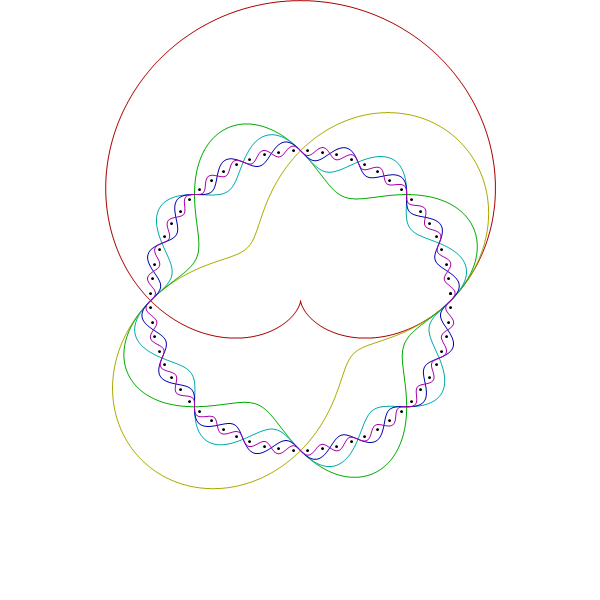
        It has the nice properties that you can do any number of sets (in theory) and all the boundary intersections are either osculating or perpendicular.

      • recursive2 days ago
        Looks like sinusoids in polar coordinates
  • jesperwe2 days ago
    I wonder why when swipeing between the two sides of the disc it always appears convex from the currently viewed side, but flat when viewed edge on.

    Anyone knows what could cause this?

    • hashmal2 days ago
      I think it's to avoid having two sets of data points. I think the "view angle" affects the "convex amount" so that edge-view = flat and all other viewing angles "bump" the data points a little bit to give the "convex" look.
  • moi23882 days ago
    Rendering and functionality is broken on iOS Safari
  • keeeba3 days ago
    Please don’t actually use these 5,6,7-way Venn diagrams for anything practical, they’re virtually useless and communicate nothing.
    • roadside_picnic3 days ago
      Technically a Venn diagram's entire point is to visualize all possible set relations between N sets. Their "practical" use is explicitly visualizing this.

      In popular terminology they are very often confused with Euler Diagrams [0] which represent meaningful relations in sets but not all possible. You shouldn't create Euler Diagrams this complex, but the raison d'etre of Venn diagrams is to visualize the complex nature of set relations.

      0. https://en.wikipedia.org/wiki/Euler_diagram

    • somat2 days ago
      There is always the complicated wires puzzle from "Keep Talking and Nobody Explodes". Where a 5 way Venn diagram encodes what action you need to take for a given state.

      https://bombmanual.com/web/index.html#ComplicatedWires

      However you could make a good argument that having a complicated and confusing diagram is the point of that puzzle.

    • emmelaich2 days ago
      Agree, I think the linked Upset diagram is better.
    • paulddraper3 days ago
      Thanks, I was just about to do that!
  • adverbly3 days ago
    Beautiful! I want to get this on a t-shirt!
  • pierrec2 days ago
    The source has a distinct face-melting vibe. Judging from leftover variables, seems like part of the original plan was to make a 7-way Venn diagram of these broad disciplines: "ART INTERFACE SCIENCE LANGUAGE TECHNOLOGY HUMANISM NETWORKS".

    The possible resulting combinations also seem to have remained in the code, going from tame concepts like "illustration" and "games", down to gems like "folksonomy", "hypernarrative", "facebook" (??)

    https://moebio.com/research/sevensets/Main.js

  • Sparkenstein2 days ago
    Can this be configurable? Like 8..9..etc
  • TheRealNGenius3 days ago
    [dead]