I just realized that I'm not sure if it's Borland or Norton who brought the blue interface to DOS first. Does someone remember who was first?
For some whom miss this deep blue and cyan. https://play.tirreno.com/game
Not sure about the blue color specifically but almost all the conventions came out of IBM's SAA and CUA initiatives. There is still a lot to find about these conventions and for some time in the early 90s every computer mag wrote about them. When I searched for the original IBM sources a while ago I could not find anything.
So, if anyone has a pointer to the original style guide I'd be very grateful.
"Borland's DOS IDEs represented what we might call brutalism in interface design."
Hmm, I think they could be perceived as brutalist nowadays because people are not aware of the technical restrictions these applications had to work with, but at least Turbo Pascal was a marvel of beauty at the time.
"Windows (after 2000) arbitrarily became more like favelas with dozens of unnecessary panels in every application, a great example of when features win over rationality."
I'd call it a slum. The Favela is X11 - poor by definition, yet charming in places, sometimes dangerous.
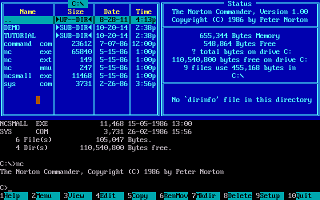
Norton Commander released its blue interface in 1986 (1), when Borland Pascal didn't have released something that had similarities with Norton Commander one year later in 1987, it was Borland Pascal 4.0 (2). And here is Pascal 3.0 for comparison (3).
UPD:
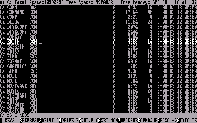
But now I'm not sure that it was NC first. Here is PathMinder (4) from 1984 and IBM FileCommand (5) 1983.
(1) https://winworldpc.com/res/img/screenshots/1x-6e0aba060e5238...
(2) https://dosdays.co.uk/media/borland/Turbo%20Pascal/tp4_compi...
(3) https://dosdays.co.uk/media/borland/Turbo%20Pascal/tp302_edi...
(4) https://www.smoliva.blog/img/cc-pathminder.png
(5) https://winworldpc.com/res/img/screenshots/IBM%20FileCommand...
https://www.scribd.com/document/693329404/IBM-SAA-CUA-Basic-...
https://www.scribd.com/document/691545759/IBM-Object-Oriente...
* https://lilypond.org/doc/v2.23/Documentation/essay/engraving...
* https://lilypond.org/doc/v2.25/Documentation/snippets/expres...
The documentation shows a number of configuration directives to control the display and confer semantics generally with the aim of improving readability.
Or in an AI model.
1. “HDR” is often referring to a tone mapping to convert the 10-14 bits of dynamic range in a camera’s raw file into the 8bits that fit into a jpeg (and often the screen).
2. HDR also refers to actually showing more than those 8bits of information. Saving more than 8bits in the image and having a screen that can show more than 8 bits of color.
#1 is real easy to make look unnatural, and most phones go over the top with it. #2 is a straightforward improvement and basically always makes the photo better.
FWIW, I've felt over the years that if you have to get used to it, it probably wasn't that good to begin with: so so many things that are totally different I've upgraded to and thought "omg this is amazing! how did I ever live before?" and, if I have to go back, it takes a long time to get used to the bad thing again.
The one example I have off the top of my head: higher resolution monitors. I was totally happy with my lower resolution monitors; but, the second I tried a higher resolution monitor, it ruined me for lower resolution monitors. I can totally get used to it again, but it takes a long time, and I really don't want to; upgrading, though, is instantaneously better.
I don't think anyone would call me artistic, even if I dabbled in typography (both of the book design and font design variety), furniture and interior architecture (some exterior too): but I keep needing to draw things starting with pure geometric shapes and precise symmetry and then move them around to make it appealing even to me.
For instance, other than the obvious curvature in pillars in Parthenon, the spacing between them is even more important: notice how outward pillars have the next one closer to avoid the vast emptiness outside unbalance them.
The same holds true for fonts, both kerning and character design, but another thing not mentioned is how medium has influenced the design (ink dispersion needs different "holes" in heavy weight forms). The same holds for architecture and materials being used.
I am also curious about the relative popularity of typography on HN... it seems to gain the interest of HN readers more than most other forms of design or art....?
Look at the discussion surrounding the typography on Pope Francis' tombstone to see how the typography conversation/debate easily transcended the religious background it originated from, which seems atypical to me.
Maybe something about the fact that it’s familiar for people working with computers. It’s approachable (needs a keyboard and some fonts), familiar (we spend our time typing and reading), well defined (it’s a succession of a finite number of shapes that are also well defined, not as Freeform as a drawing).
They didn't have printing press or some conscious aesthetic architecture-typecafe correspondence. That's just how the letters evolve if you want to quickly and densely copy them with a quill. It's like trying to draw meanings from connections between cuneiform and ziggurats.
https://en.wikipedia.org/wiki/Blackletter
"Why do all of this? Because otherwise, the base of the building would look like it was sagging, and the columns would look like they were about to fall outwards."
Or, you know, it would ACTUALLY sag. The columns would ACTUALLY fall outwards.
Despite that, during the "Gothic" time, the Gothic writing style preferred in Northern Europe (Textura quadrata, or Textura sine pedibus for the most expensive manuscripts) was clearly different from the Gothic writing style preferred in Southern Europe (Rotunda), the Northern one replacing all curved lines with broken segmented lines and having taller and narrower letters, while the Southern one preserved some of the curved lines and had wider less tall letters.
The same style differences could be seen in the architecture of expensive buildings, like churches, so there is little doubt that it was a difference in taste, not a difference caused by material constraints. The material constraints only caused both styles to use condensed bold letters, together with a lot of abbreviations.
As for what you said about the sagging and the pillars falling out, that’s also incorrect. In the article, I mentioned the classical orders, which are Doric, Ionic and Corinthian. Only Doric temples used the curvature of the stylobate and the inclination of the pillars throughout. In the other two styles, this was very rare, if it happened at all. The two largest temples of the other two styles didn’t have it for example: The temple of Olympian Zeus in Athens is a Corinthian style temple which has a flat stylobate and no inclination of the columns. The same goes for the Artemision (Temple of Artemis) in Ephesus. There are countless other examples. The entasis is (mostly) the only thing that was transplanted from the doric style to the other two.
"The only problem with Microsoft is they just have no taste. They have absolutely no taste. And what that means is – I don't mean that in a small way, I mean that in a big way – in the sense that they don't think of original ideas, and they don't bring much culture into their product. "
All those original ideas they lifted right from Xerox Parc.
Edit: Sorry, forgot we were talking about design ideas. All those original ideas they lifted right from Braun.
Its like saying Xerox just lifted it all from the Mother of All Demos.