Anyway, this reminded me of that. Making these pictures in anything but the tools of the time wouldn't just change them, they'd be totally different artworks. The medium is part of the artwork itself.
For example, Bach's music was shaped by the fact that the harpsichord had no sustain. The piano changed that, but "upscaling" Bach's work to take advantage of this new technology would destroy them. You use the new technology to play them as they were written for the old. The beauty comes through despite the change.
It wasn't until I think around the advent of recorded music and electric amplification that it settled into a fairly stable set of instruments & sounds produced by them.
The music of the classical canon is unbelievably fantastic, and it deserves respectful treatment, but the genre has lost the audience for cool new sounds. It’s very unfortunate.
It's simply not the role of any one musical practice to be at the forefront of experimentation forever. What we now call classical passed its torch on generations ago, and rock & jazz have now settled in too. We have hip hop and electronic music taking this role now, and eventually they will bind up into their own conventions and some descendant of theirs will push on.
This annoying behavior does not win me any friends but remember that the great classical composers were the rock stars of their day.
I don't have a source for this but I hear it a lot and I strongly suspect it is a historiographical myth. Pretty much only a very small minority urban (relative) elite had access to live professionally performed classical music during most periods when it was being composed. This is also the group whose writings form most of our current knowledge base about these periods, and whose writings are of course focused primarily on their own interests. We can't really see what they didn't see, or didn't care enough to write about.
But contemporaneous with this elite music there were european folk music traditions, taught and performed ad hoc by individuals or small ensembles in homes and gathering places of the vast majority of "normal" people (peasant farmers, later urban laborers), and including some traveling performers who were known by reputation.
So yeah the great classical composers were wildly popular among the people who listened to the kind of music that they composed, but that was an extremely small part of the population. We don't have very much information at all about what was going on musically with the greater part of the population, but it appears to have been a completely separate thing, it's doubtful the great composers had any name recognition among the vast peasant masses.
Hell, in a century you’ll see string quartets banging out Aphex Twin at elegant soirées. The real connoisseurs, of course, nod knowingly and mutter that drukqs is “early period”.
Similarly, plainsong was seen as “classical” music for many centuries, and was also a largely rigid form, but there exist some absolute bangers in the canon, mostly unattributed because monks.
It’s hard to see the sweep of history from within it.
The last (well only) time I was in an opera house the retirees were listing to Blue Öyster Cult.
But there is an absolutely thriving collaboration- and improvisation-based music form grounded in jazz but open to novel & experimental instrumentation and ripe with influence from other contemporary forms like pop, hip hop, funk, reggaeton, metal. I'm thinking of people like thundercat, kamasi washington, nuclear power trio, tigran hamasyan, robert glasper, sungazer, domi & jd beck, louis cole etc.
If you like the sound of old school jazz, the standup bass the piano the brush drum shuffle, this stuff will be alien and hostile and won't feel like jazz to you. But if you like the musicianship of jazz, watching masters collaboratively invent new music in real time, this is where that ended up.
But here are lots of Bach synth albums and only Wendy Carlos’ work has the taste and obsessive fidelity to the original compositions to allow those ideas to come through. Most synth Bach falls into the trap of being idiomatic synth rather than idiomatic Bach, akin to playing Bach on the piano without considering how it would have sounded on the harpsichord.
https://archive.org/details/wendy-carlos-witched-on-bach
(have to donate to Internet Archive again now…) anyway Wiki says this album essentially brought the Moog/synths from experimental to popular music. In a lovely fashion, my ears do say.
Wendy Carlos is still with us at 85 years of age, but apparently hasn’t been able to press CDs for two decades, and hasn’t licensed her music for streaming. Her site links to CDs on Amazon, w/o new copies available. She sounds dope, even being an “accomplished solar eclipse photographer” per Wiki.
If anyone knows her I’m curious if someone could help her preserve/distribute these beautiful sounds. (Maybe they’re all preserved but just not distributed, and maybe she’s chillin’ and doesn’t need another cent so it’d just be hassle—wanted to throw it all out there for y’all.)
—
…thanks OP for the great art btw, since I haven’t mentioned it yet. Stood the test of time!
& I’m going with your assumption! Thanks for the positive perspective & background.
Mars. That track is so great! All of them are, but that one shows off so many great synth techniques. One passage is noise that ramps. The spectral distribution changes, from emphasis on low notes to emphasis on high notes while the overall energy remains close to the same.
I remember it because I have never heard anyone else do that in a composition.
Recommendation seconded!
Gaming embraces most of its historical aesthetics while say movies do not. There aren’t serious attempts to replicate the aesthetic of 50’s tv (which are tied in heavily with the culture of the time) similarly, jn the eighties and I imagine prior, I’ve been watching Miami vice and you can tell lots of the rooms are cheap sets with pretty minimal props. This is on the one hand definetly not full formed, but on the other hand I’ve grown to appreciate that aesthetic, And again other art forms like painting and video games seem to appreciate all eras of aesthetics in their modern versions in a Way tv and movies don’t. (Maybe just due to expense?)
Was this the artist’s vision, or were they simply making the best of the tools they had?
Academic Western poetry shed the metre and the rhyme in an attempt to be free from limitations and more fully express things. Can you quote something impressive? OTOH rap, arguably the modern genre of folk poetry, holds very firmly to the limiting metre and rhyme, and somehow stays quite popular. If rappers did not need rhyme as a tool of artistic expression, they probably would abandon it, instead of becoming sophisticated at it.
Same with pixel art, and other forms of pushing your medium to the limits, and beyond.
It’s still a case where the developer can’t truly express their vision, but they can express it behind a filter, in this case pixelation, that makes our brains charitably fill in the missing details.
Although I’m sure for some games it is part of their vision, because there’s something intrinsically pretty about pixel art and low-poly 3D. Likewise there are 2D games like Cuphead that emulate “cartoon” style, and 3D games like Guilty Gear that emulate 2D anime; those are much harder than making a 2D or 3D game with traditional modern graphics.
Old video games come to mind. The box art would be drastically different than the look of the game. The box art was the vision, the game was what they ended up with after compromises due to the hardware of the day. I think it’s only been in the last decade or so that some game makers have truly been able to realize the visions they had 40 years ago.
A point of comparison would be to the game Quake, which came out the same year, and whose graphics felt light years ahead . But Quake mostly became a multiplayer hit, as the single-player story and overall atmosphere weren't very compelling.
I'd be inclined to agree about some older Zelda games though, namely Wind Waker. I replayed it on GCN recently, and can attest that HD Wii U version really didn't add anything to the aesthetics.
And even the new ones that have gone back to that style have the same 'look'(obviously because they're trying to be like those old games) but the graphical fidelity doesn't seem to change much beyond more pixels.
I tried Claude and it mentioned the term might actually be „Aesthetic sufficiency“, but I couldn‘t find an essay with Homeworld on it.
To me they look horribly pixelated and at least some would improve aesthetically a lot for me with a higher resolution.
(A pixel-art specific upscaling filter would mitigate that issue, of course.)
But if you folks enjoy them, go for it. Otherwise taste is subjective I think.
Another example from the early '90s is MARS.COM (1) by Tim Clarke (1993). Just 6 kilobytes and 30+ fps on a 12MHZ 286 (2).
1. https://www.youtube.com/watch?v=_zSjpIyMt0k
2. https://github.com/matrix-toolbox/MARS.COM/blob/main/MARS.AS...
But that doesn't mean I would enjoy a pixelated image now more than a high resolution image of the same motive.
That being said, although there are also some extremely good examples in here (in my subjective opinion), I absolutely think there is a nostalgia element at play. I worked on these machines in the 80s and feel that nostalgia myself.
Some games, like Borderlands or Wind Waker, use aggressive cell shading. They age like wine, because the game has a distinct art style that gives it character.
There are also some great blog posts by the obra dinn guy about 1-but dithering. They make the rounds on HN once in a while
But that was my not well received point about nostalgia ..
https://oaksnow.com/retrodither/
There’s also a chapter in my new book explaining how to write the same program in Python including Atkinson dithering, the MacPaint file format and MacBinary. You can get the code for free and do the conversions yourself without Retro Dither here:
https://github.com/davecom/ComputerScienceFromScratch
The book is here:
Of course, in order to get square pixels, you needed to enable interlace as well.
You can try Screenitron to imitate something like this.
That's how I fell in love with Monkey Island and Flashback
http://www.effectgames.com/demos/canvascycle/ (hit "Show Options")
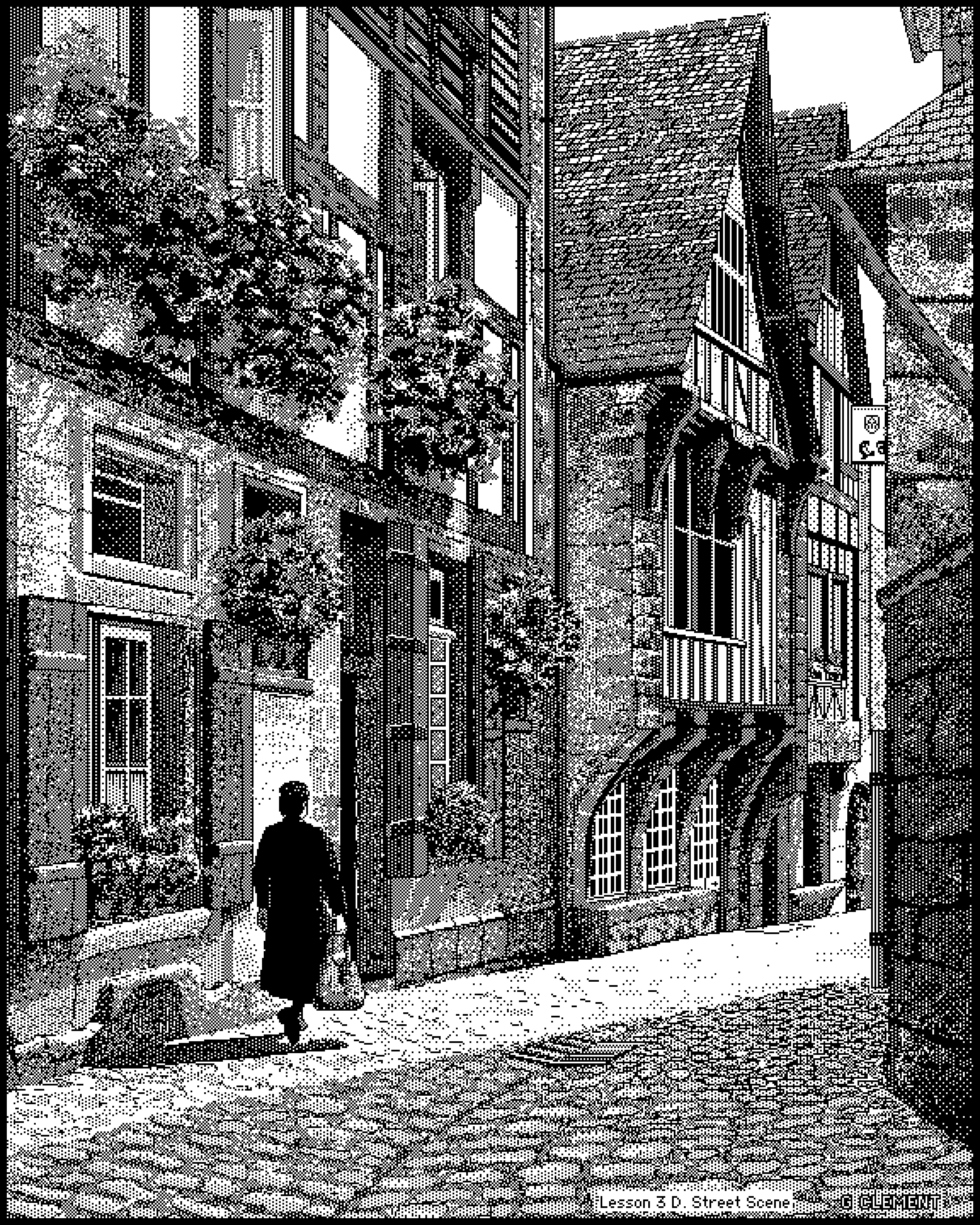
How do you even do that? Zoomed out it looks like a nearly photorealistic street scene, zoomed in I just see seemingly meaningless patterns of black and white. Magic. Unbelievable.
Scanned drawing + painting over it with dither patterns is an option too.
Dithering, for one. The parent also suggests pointillism, which was also a popular modern art technique for making detailed portraits using small, low-detail components.
https://www.cultofmac.com/news/pinot-w-ichwandardi-flatiron-...
What’s wild is that would be true for every single human work up to about the mid-1800s. Art - and architecture - would be made to be seen either in sunlight, with its attendant shadows and shifts throughout the day, or by firelight, which flickers and shifts on its own.
The constraints of the original Mac and MacPaint have resulted in an art form specific to the time and place.
(From page HTML source) <!-- ******** HELLO OLD COMPUTER USERS ******** --> <!-- This site is designed to be viewable at 640x480 resolution or higher in any color mode in Netscape/IE 3 or any better browser, so if you're using an LC III or something, you're welcome. In fact, I really hope you are using such a machine, because limiting the site to this level of simplicity wouldn't be worth it unless someone is. Please let me know if you are using an old computer to visit the site so I know it is worth it to someone to maintain this compatibility. I do apologize for the one javascript error that you may get on each page load, but I don't expect it to cause any crashes. The major exception to all of this is Netscape 4. That thing sucks. -->
Does anyone even remember why Netscape 4 was bad?
Netscape 4 is a broad set of releases over several years. It also wasn't necessarily "bad". It was just largely not mindblowingly better than Netscape 3 (for normal users) while using more CPU and RAM.
I also imagine in this context it's incomplete CSS support is problematic. Netscape 3 will ignore properly commented out CSS (mostly) while 4 will try to interpret what it can and choke on the rest. It's box model doesn't conform to where the CSS spec landed so even if you can give it CSS it can handle, your page is broken in every other browser.
At the end, there was something like acceptable variation in page view for different browsers.
Thanks. Learning web development back then left some deep scars and lasting lessons. I can no longer imagine all the other stuff I haven't retained because I remember stupid browser quirks from nearly three decades ago.
Getting many designs working consistently between IE and Netscape was impossible. The 640px wide left-aligned table layout was popular for years because it was the easiest common denominator that looked acceptable in both browsers.
Take for example VRML, particularly VRML 2.0. I don't remember the software name, but there was a chat system within a virtual world, perhaps running in a browser (1).
1. https://csdl-images.ieeecomputer.org/mags/cg/1999/02/figures...
DHTML in Netscape 4 was also completely incompatible with DHTML in IE 4. In IE you had the DOM, which is an inconvenient and inherently very inefficient interface that you could coerce into doing anything you wanted. In Netscape 4 you had layers. Our team (KnowNow) was working on an AJAX and Comet toolkit at the time (02000). In order to not write separate versions of our Comet applications for the two browsers, we stuck to the least common denominator, which was basically framesets and document.write.
https://en.wikipedia.org/wiki/Netscape_Navigator#:~:text=Thi...
But I also don't think 3 was much better.
https://macintoshgarden.org/apps/macgrid
Incidentially /r/VintagePixelArt often has discussions about this sort of thing.
Obviously a large part of it is likely due to the fact that a lot of the creators grew up with the NES or SNES and just like that aesthetic, but I think you get a lot of "implied detail" when using pixel art, which is great when you're working on a limited budget.
This isn't to knock it, to be clear. I love good pixel art.
https://en.wikipedia.org/wiki/View_of_the_World_from_9th_Ave...
Software outfit founded by a French guy, as hinted by the drawing with Paris visible ...
(Those "view from ..." were plentiful at the time)
At the end of the article they mention digging in to the Amiga scene. If you want to feel old, Deluxe Paint turns 40 this year. My mates had Amigas (I had an Amstrad) and the computing world just felt full of wonder and promise. It was a magical time of creation.
As an aside: Do your best to capture at least something in a way that will be preserved.
When I was a kid, I owned a monochrome display that could only display at CGA resolutions “640x400” 1-bit (and 320x200). Many games and art and didn’t support that showed up garbled.
Then I got hold of Deluxe Paint that would load pictures in color and dither them with an algo called Floyd Steinberg. And the pictures that I saw on my friends VGA monitors suddenly looked beautiful on my monochrome screen.
See examples https://surma.dev/things/ditherpunk/
Games like Monkey Island were also ditherered for monochrome displays and they looked great.
Don't know this guy's technique, but the idea that people were drawing such elaborate pictures on tiny screens - with mice! not even tablets - boggles me. Every pixel a deliberate act.
But no, it's just how that sort of black & white shading looks when you scroll past it - amazing effect!
For example, I was making animations with EasyToon, and I only had a mouse, while the really good animators were using graphics tablets.
Clearly, if I bought a tablet, my own animation skills would drastically improve!
I guess I still kinda believe that, when I look at how fancy some of the newer computers are. If only I had one of those, my creativity would be unlimited!
The funny thing is that my fallacy sorta came true: my friend was showing me some insane stuff he rendered on his 5080 with a custom Stable Diffusion...
Preview is great to some extent and does a lot of useful things for me but it's designed to modify existing images, and I'm still missing a software to draw a square, circle, some text etc.
Thank you, will try! I'm kinda missing this ms paint feel on some specific situations
Take the first one, "acius.png", at 84,326 bytes. If you losslessly scale back to the original size (1/4th) and convert to 1-bit NetPBM, it's 51,851 bytes, without compression. I thought that was remarkable.
  $ oxipng -o max --strip all -avZ --fast acius.png
  Processing: acius.png
      2304x2880 pixels, PNG format
      8-bit Indexed (2 colors), non-interlaced
      IDAT size = 84251 bytes
      File size = 84326 bytes
  Transformed image to 1-bit Indexed (2 colors), non-interlaced
  Trying filter None with zopfli, zi = 15
  Found better result:
      zopfli, zi = 15, f = None
      IDAT size = 24466 bytes (59785 bytes decrease)
      file size = 24541 bytes (59785 bytes = 70.90% decrease)
24541 bytes (70.90% smaller): acius.pngI can think of a few reasons why this may be the case, but I’m looking forward to chewing on it for a bit
Also, "a door somewhere" reminds me of old album covers. For whatever reason I'm thinking of Lou Reed's "take no prisoners".
What a nostalgia trip. Reminds me of sitting in the computer lab in the library in my elementary school in 1990. Some days, I'd give anything to go back.
Instead it was gatekept for grifters in order to separate gullible teenagers from their allowance.
We like it today because of the nostalgia/retro factor.
To contrast, a lot of content from clip-art collections at the time looked awful then and didn't age well at all.
James Leftwich: http://www.macpaint.org/jimwich.html
Bert Monroy: https://www.bertmonroy.com/
Laurence Gartel: https://digitalartmuseum.org/gartel/bw.html
So maybe for some values of "great." Maybe.