a) This is a clone of Whitney, an incredibly beautiful and unique typeface from 2004
b) Whitney was designed by Tobias Frere-Jones
c) He was an equal co-founder of the H&fJ foundry
d) He designed the vast majority of their most famous fonts, including Gotham, Archer and Armada
e) Somehow, for years, Hoefler never did the paperwork to confirm FJ's co-ownership
f) When pressed, he instead kicked FJ out, kept all the fonts and renamed the shop "Hoefler"
Hoefler is an asshole. A free clone of Whitney is the least of what he deserves.
Source Sans is nice and easy to read, but so overused it’s rarely a good starting point for a visual identity.
Glyph proportions between Whitney and Nebula are almost identical. As are their weights. Source Sans is substantially heavier and more dense looking.
While individual glyphs may be closer between Nebula and Source Sans, but the overall feel of Nebula is that of Whitney.
I'd rather use Source Sans then.
* the latest OTF
* the Source Sans 2.020 TTF, which is the last version (at least, the last version released in the GitHub repository[0]) that has manual hinting
> The majority of the adjustments we made were to adapt the metrics of Source Sans to better match those of Whitney SSm
Scroll down to "Comparison of Nebula Sans versus Whitney SSm" part of the linked page.
I was literally going to complain here that it was a Whitney clone before seeing them mention it on the page.
That's what the parent commenter means by 'They just matched the outer dimensions of Whitney'.
In other words, metrically compatible. To the untrained eye, metrically compatible typefaces all look the same, because they're meant to be swapped between each other. In my view Whitney and Source Sans couldn't be more different. The stroke cuts in Whitney are angled, they're perpendicular in Source Sans. The lowercase 'b', 'e', and 'g' are very different in both fonts.
EDIT: I created such a comparison. See neighboring subthread.
Excuse me?
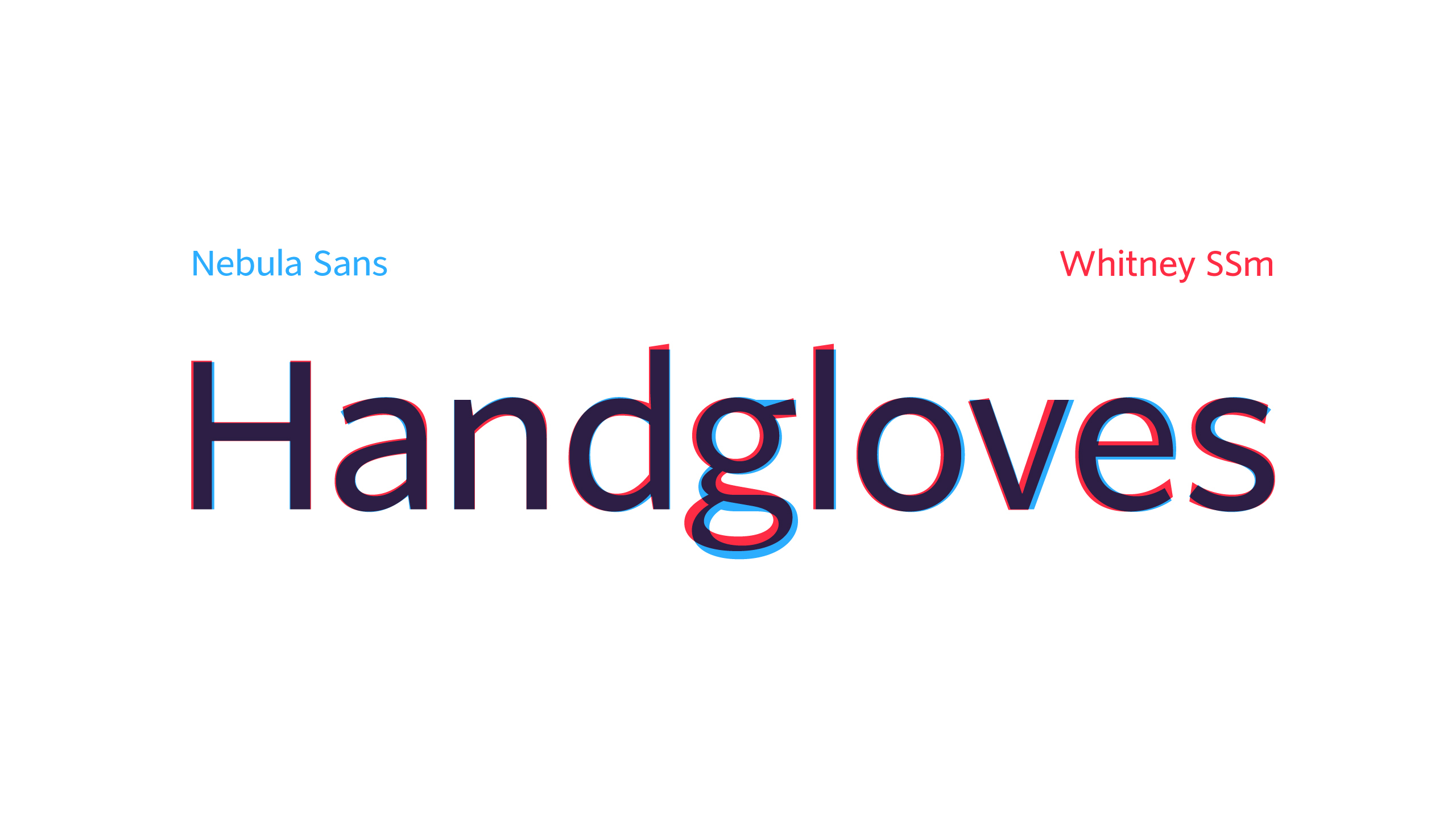
Nebula has flat terminals, Whitney has angled terminals.
(There’s a lot of other differences but that one effects most letter shapes).
Anyway, I'd like sans serif fonts more if they were readable, including being able to distinguish Weird Al from Weird AI.
[1] https://en.wikipedia.org/wiki/Intellectual_property_protecti...
It’s funny - I subscribe to Nebula (a “boutique” video platform) and subconsciously have felt these things that are talked about in both videos, but I needed someone to point them out to me for me to consciously notice.
{font-variant-numeric: tabular-nums}
And if you want more, there is also https://www.google.com/url?sa=t&source=web&rct=j&opi=8997844....
Thanks for pointing out, indirectly, that there’s a lot more content than I had assumed!
If only Apple could figure this out and use it for the iOS clock app.
Reminds me of how fira code (my favourite font for code) can be adjusted to match the preferences.
It can absolutely be a part of a texts character and reducing this entire field to a *bubble* is a feeble attempt at spinning ignorance as a virtue.
Fonts have different metrics which affect recognisability, legibility, and understanding. There are fonts which evoke a feeling (think heavy metal band), others which are practical (exaggerated letter forms to help dyslexia), and many many many bad fonts too, such as ones with bad kerning which make words like “therapists” read “the rapists” or “morn” read “mom”.
The fonts you have on your computer are all different and have their own strengths and weaknesses which affect you and your perception of what you read, even if you’re unaware of it.
> Researchers put the font to the test, comparing it with two other popular fonts designed for legibility—Arial and Times New Roman—and discovered that the purportedly dyslexia-friendly font actually reduced reading speed and accuracy. In addition, none of the students preferred to read material in OpenDyslexic, a surprising rebuke for a font specifically designed for the task.
> In a separate 2018 study, researchers compared another popular dyslexia font—Dyslexie, which charges a fee for usage—with Arial and Times New Roman and found no benefit to reading accuracy and speed. As with the previous dyslexia font, children expressed a preference for the mainstream fonts. “All in all, the font Dyslexie, developed to facilitate the reading of dyslexic people, does not have the desired effect,” the researchers concluded. “Children with dyslexia do not read better when text is printed in the font Dyslexie than when text is printed in Arial or Times New Roman.”
https://www.edutopia.org/article/do-dyslexia-fonts-actually-...
The fonts we actually use are interchangeable, and people outside the font bubble won't even notice the differences.
For a more directly relevant example, companies frequently A/B test changes to a UI to see which ones people like better. The specifics of those changes would be pretty marginal if you didn't know what it looked like before (like if you're a new user, you wouldn't notice if the notification was red versus purple, or what the wording in the menu is). Despite this, there are some sites that just "feel" better in a way that you can't really describe.
All of this is a long-winded way of saying that I can't tell if I'm looking at Arial, Helvetica, or this Nebula Sans font unless they were side by side (and even then I'd just be saying they're different, not identifying them by name). But I think the site would feel a lot less modern if it were written in Times New Roman. I think you'd notice if it were too hard to read when small, and I think if it looked "bad," you'd at least subconsciously notice that.
Again, just because you’re unable to notice how exactly you’re being affected does not mean you aren’t. You also don’t notice all the ways you’re affected by advertising, but they still work on you.
Yes, of course not every single subtle change to a font makes a huge impact. Just like a single subtle change to a colour’s hue doesn’t. But pronounced changes do, even when you’re unable to put your finger on it.
If it were a non-fashion criteria, surely we'd be hitting a local maximum on readability.
I don't need or want my everyday use font to "affect" me, or to "make impact" -- that's the branding world, again, and not aligned with readability.
> Ok, it is a font alright. To me, it looks exactly as all the other fonts I have on my OS already, but I guess that's just how it is if you are not in the font bubble.
So, yeah. Grandparent tried to justify this new whatever by saying lots of words, none of which really seemed to matter outside of the font bubble.
Just because you are ignorant of something doesn't make it insignificant. That the significance is lost on you is YOUR problem.
There is no perfect font, just like there is no perfect framework. You pick what suits you or makes sense for your project. Sometimes you don’t understand your requirements until you try to use something.
> I don't need or want my everyday use font to "affect" me, or to "make impact"
And being aware of the details is the best way to avoid that.
> Source Sans was the perfect foundation for Nebula Sans because it shares many primary characteristics with Whitney SSm, our previous brand typeface
One differing characteristic presumably being requiring payment to Hoefler & Co.
Their video explains it way further and is worth a watch.suprisingly captivating. (You can select no and view it without paying)
https://nebula.tv/videos/nebula-sans?ref=nebulasans
It's also worth watching this video if you are interested in how this works.
It's a super interesting video on the history of fonts and how digitizing it works.
* Monotype
Subdued, muted and neutral seems to be very much “in” at the moment. On one hand it definitely gives us highly readable, usable interfaces and text. But I do miss the chaos and vibrance of the early web. Modern web is starting to look really washed out.
Flat design is the more sucky partner to neutral palettes in current design trends, IMO. I want color too but it's not a clear step towards usability. I think the return of gentle skeumorphism would be a good step for general usability.
Sadly to me Wittney feels clean yet coherent, Nebula Sans feels characterless like a UI thrown together without any real font choice made yet.
Given these, why does this typeface deserve a new name? It is Source Sans, full stop.
At least Arial (Helvetica copy) and Segoe UI and Myriad (Frutiger copies) have a handful of distinguishing glyphs.
I have a very hot take—with typefaces, you absolutely get what you pay for. I don't like the vast majority of SIL Open Font Licence type faces, with a handful of exceptions. Most of them have glyphs that are an absolute eyesore, are weighted, sized, hinted, and kerned terribly, don't have any character whatsoever (they're all copies of copies of copies of Helvetica) and don't encode nearly enough glyphs/combining marks in Unicode.
Hint: if I can't type IAST/ISO 15919 without tofu showing up, then the font doesn't have enough Latin glyphs.
The majority of digital fonts are either not hinted at all (which makes them look like crap on low – medium resolution monitors), or appear to be hinted on and for macOS, which doesn't have sub-pixel anti-aliasing, but rather greyscale (i.e. full-pixel) AA. The result looks quite bad on Windows and Linux. It looks bad on macOS in monitors with lower pixel density, too.
I will gladly pay for a well-designed typeface (or by proxy, pay a font database subscription). The effort that designers have to put in to design something new from complete scratch is immense. Designers have to come up with unique glyphs, and then when actually setting up the curves, then have to think about how the typeface will vary along several dimensions: weight, size, display pixel density, print versus display, and so on. It's no wonder that the best fonts cost thousands.
Good fonts that have both character and are immediately legible without being unnecessarily fancy is an extremely fine line to tread and in my opinion only a handful of typefaces have managed to balance all of these through the centuries. Some of my favourites follow.
Sans-serifs include Helvetica, Frutiger, Futura, Myriad, Johnston, Optima, Transport, DIN (and its many variants; my favourite is FF DIN), Ocean Sans, and Segoe UI.
Serifs include Roman-cut (including Trajan), Garamond, Minion, a handful of Didone types, Berkeley Old Style, and Palatino.
A few tens of euro for desktop use? Sure. But when that font's supposed to be part of an organisation's identity, I'll need it for web use as well, which can be 10x as expensive. And when I want to e.g. generate invoices, that's even more money again, yearly.
I only work with small clients on things like this, but I've never had anyone willing to pay the money. Free fonts might not be as good, but that's not relevant for me, because paid fonts just aren't an option.
But a universal font makes sense. It's almost odd that this is so rarely said out loud.
Same goes for IBM Plex, by the way.
Another commenter pointed out IBM Plex which I also like, but I have a bit of an issue with the lowercase Roman 'a' glyph, where the bottom curve into the vertical is a tad bit too thin for my liking.
As a rule of thumb, if a company has paid a foundry a handsome sum of money for its corporate branding and wants to use the resultant typeface everywhere, the result is usually quite decent, and has what I call 'character without being excessively fancy'.
Playfair is Didone, and I feel Didones (this includes TeX's default, Computer Modern) don't really do well on displays because of the very high contrast between the ball serifs and rather thin vertical strokes. Otherwise it's a nice Didone: I'd use it, but as a printed typeface.
I'm not the biggest fan of Ubuntu. Especially the lowercase 'r', it's got a weird shape.
I appreciate the site’s overview and comparisons and such too
Here's an image showing some overlay examples: https://i.imgur.com/1sdXiNY.jpeg
Of course you can adjust char spacing, but normally font designers will make a condensed variant to make that work for corner cases.
You're presumably referring to variable fonts, aka multiple master fonts/MMF.
Making a multiple master font is massively more work than discrete variations. The complete total number of MM fonts in existence is a 2- or 3-digit number, out of at least tens of thousands of fonts, if not millions.
Demanding or implying that fonts should be MM in 2025 is just plain out of touch with reality.
Inter is a just slightly bolder by default.
The font looks ok. This is an off putting sample sentence though. It sounds like a secular, pseudo-liturgical version of the Nicene creed.
Particular scientific theories may be believed in (or not believed in).
That said their samples sentences also include things such as "We’re assembling a crew for a heist" so maybe not take these things too seriously?